CRAFTED. NOT GENERATED.CRAFTED. NOT GENERATED.CRAFTED. NOT GENERATED.CRAFTED. NOT GENERATED.CRAFTED. NOT GENERATED.CRAFTED. NOT GENERATED.CRAFTED. NOT GENERATED.CRAFTED. NOT GENERATED.
CRAFTED. NOT GENERATED.CRAFTED. NOT GENERATED.CRAFTED. NOT GENERATED.CRAFTED. NOT GENERATED.CRAFTED. NOT GENERATED.CRAFTED. NOT GENERATED.CRAFTED. NOT GENERATED.CRAFTED. NOT GENERATED.
A scroll through real moments from Dragon's Den, Consumer Electronics Show, and personal milestones.
Product I designed appearing on Dragon's Den
The app that shipped to Canadian Tire shelves
Smart home iOS App unveiled at the Consumer Electronics Show in Las Vegas, designed by me
Winning 2 awards at CES
Marine ecosystem I designed end to end
Marina dashboard demoed at CES — winner of the IBEX 2023 Innovation Award
Recruited onto the MSAN team at Microsoft AI
"YES!"
Joining the Samsung Research Canada Team
And here we are
Scroll to zoom in
So Eun AhnProduct Designer, Microsoft
“He strikes a strong balance between creativity and practicality, ensuring his designs are not only visually compelling but also user-centered and technically sound.”
★★★★★
Alice LeeProduct Designer, Amazon Prime
“From the very first moment he joined our team, he brought a warm, vibrant energy that was both inspiring and uplifting. His collaborative spirit and genuine kindness made an immediate impact.”
★★★★★
Ashaya SharmaCTO, Honeycomb AI
“Few know product. Few know people. Few have engineering mindsets. Tash is the rare person who knows all of the above and is an absolute joy to work with.”
★★★★★
Maz HaqueProject Management Professional
“From video production to website design and asset creation, Tashfiq consistently delivered high-quality work that exceeded expectations. What set Tashfiq apart is his innovative approach and dedication to his craft.”
★★★★★
Sanad AridaCTO, VoltSafe Inc.
“Tashfiq has an extraordinary ability to bridge engineering and design, delivering solutions that are both technically robust and beautifully crafted. He elevates every project he touches.”
PropKeep gives independent landlords a single place to run their properties.
Product DesignUX ResearchProof of Concept
Most independent landlords are running their operations inside their heads
My dad manages several rental properties and Airbnb listings. His tenants messaged him on WhatsApp at all hours — trivial questions mixed in with urgent repair requests, no system separating them. He’d keep a mental log, try to diagnose problems over text, then scramble to find someone to fix them. He was constantly flustered, constantly reactive, constantly tied to his phone.
That was the starting point for PropKeep.
Landlords aren’t disorganised — they’re using the wrong tools for an operational problem
The real issue isn’t that landlords are careless. It’s that they’re running an operational system using communication tools. WhatsApp and texts are designed for conversations, not for tracking work states or scheduling repairs. Every task lives in their head or in a thread they’ll never find again. PropKeep’s job was to turn that incoming chaos into structured, trackable workflows.
The risk was building something that added to the problem instead of solving it
Landlords already had enough to manage. The danger with any new tool was creating yet another thing to monitor and maintain. If PropKeep required significant setup, data entry, or daily habit changes, it would fail the people it was designed for. The product had to reduce friction from the first interaction — not introduce new kinds of it.
“Automate capture and dispatch, but preserve agency.”
I scoped the product tightly around the maintenance workflow
Early on I mapped out everything PropKeep could be — rent tracking, cash flow reporting, tenant management, financial dashboards. I ruled all of it out. Adding financial tracking would have split the product’s identity and diluted the core promise. The app needed to do one thing well: make sure no repair ever slipped through the cracks.
What I left out deliberately
Rent income and net cash flow tracking
ROI and investment reporting
Excel-style property management views
Tenant profiles and lease management
The “Book-a-Pro” feature was the most complex design problem in the product
Connecting landlords to vetted service providers sounds simple but involves location matching, availability windows, trust signals, pricing transparency, and liability questions. I designed a booking flow that surfaced relevant pros quickly and gave landlords enough information to make a confident decision without needing to leave the app or make a phone call.
The dashboard needed to communicate urgency without creating anxiety
A landlord opening PropKeep first thing in the morning should immediately see what needs attention today — not a wall of equal-weight information. I designed the hierarchy around time-sensitivity, surfacing overdue tasks and pending tenant requests above general maintenance logs and completed work.
The strongest signal of success would be landlords stopping their mental notes
PropKeep is a proof of concept, so there are no live usage metrics yet. But I defined a clear behavioural signal for success — landlords stop relying on memory and external notes. If a user says “I don’t have to remember this stuff anymore,” the product has done its job.
Final product
What I learned and what comes next
Building PropKeep sharpened how I think about tools designed for people who don’t think of themselves as “software users.”
Cognitive load reduction is a design goal, not a side effect
Scoping ruthlessly early is harder than it sounds when the problem space is genuinely broad
The most complex UX challenge wasn’t the main workflow — it was the marketplace layer sitting inside a task tool
Proof-of-concept work still needs defined success signals or there’s nothing to design toward
The next version would start with user testing the tenant-facing request flow — that’s the entry point for every task in the system, and getting it right is what makes everything downstream work.
VoltSafe Winter keeps your engine alive when temperatures drop below freezing.
Product DesignIoTReact Native
I joined VoltSafe as founding designer when the company was headed to Dragon’s Den
VoltSafe makes a magnetic smart plug for cold-weather drivers — the kind of people who wake up at 5am in a Canadian January and need to know their engine block heater actually ran overnight. I was the first and only designer at the startup, brought on as the company prepared for its national television debut. My early prototype was used live on air, and that season’s episode became the highest-value deal in Dragon’s Den history — all five Dragons entered a bidding war over VoltSafe.
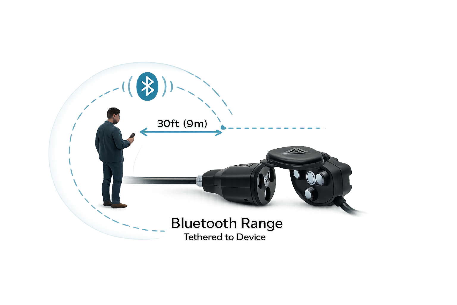
The original app worked over Bluetooth — which meant it only worked if you were standing next to your car
The first version of the app was Bluetooth-only. That kept everything local and simple to build, but it came with a hard physical constraint: you had to be in range to interact with your device. For a product designed around remote engine management, that was a fundamental mismatch. Schedules weren’t backed up to the cloud, which meant the device needed to be reflashed whenever something went wrong.
Users were asking for remote access, cloud schedules, and status alerts — none of which Bluetooth could deliver
VoltSafe ran a feature upvote program where users logged and ranked what they wanted most. Remote on/off, cloud-backed schedules, and status notifications were the top three. Every request pointed to the same gap: the architecture couldn’t support the product users needed it to be.
A frozen engine at 6am isn’t a UX problem — it’s a safety problem
If a plug was knocked loose overnight, users had no way of knowing until they turned the key. No alert, no status check, no fallback. For drivers in Edmonton or Winnipeg where overnight lows hit −30°C, an unheated engine can mean a missed shift, a missed flight, or a car that won’t start for hours. The Bluetooth architecture couldn’t support the safety layer this product needed to be.
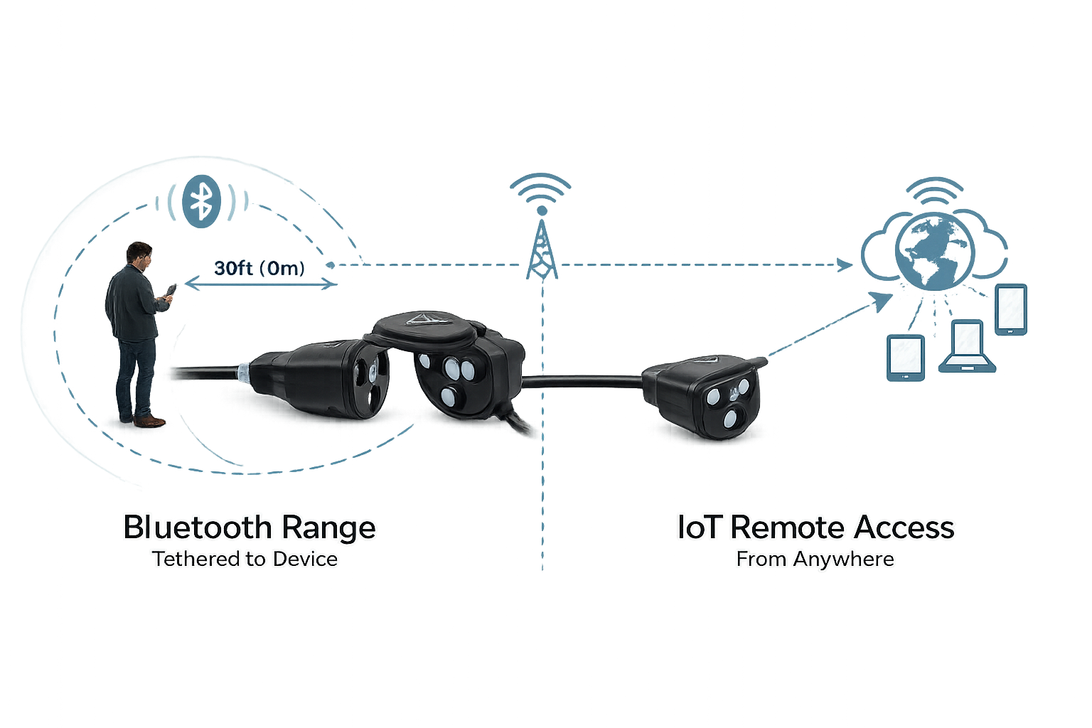
I introduced an IoT framework to move the product beyond its physical limits
Rather than patching Bluetooth with workarounds, I brought IoT architecture into the product scope. This was a strategic shift, not a feature addition — it changed what the product fundamentally was. With IoT, the app could reach the device from anywhere, sync schedules to the cloud, and push real-time status alerts. I worked with the CTO and two back-end developers to scope and implement this within our React Native build.
What I scoped out
Advanced energy monitoring dashboards — useful, but not the core safety need
Social or community features — no evidence users wanted shared schedules
Geofencing auto-triggers — deferred until IoT stability was confirmed in production
Scheduling was the most-requested feature and the hardest to get right
Automated schedules were the top-rated request. The design challenge was making schedule creation feel simple for non-technical users while handling cloud sync, timezone logic, and device state underneath. I worked through multiple iterations of the scheduling interface — testing time-block selection, conflict handling, and confirmation states — before landing on a pattern that felt reliable and easy to trust.
Remote on/off needed to feel instant even when it wasn’t
Latency is unavoidable in any IoT system. The design question wasn’t how to eliminate it but how to keep users feeling in control despite it. I designed optimistic UI states that gave immediate visual feedback on toggle actions, with clear loading and confirmation indicators that set accurate expectations without making the interaction feel slow. Getting this right required close back-and-forth with the front-end developer to sync state transitions between the UI and the hardware response.
The IoT-enabled app launched in Canada alongside the physical product in major retail chains
VoltSafe Winter shipped as the companion app for a product already on shelves at Canadian Tire, Home Depot, Rona, and Federated Co-op locations across Canada. The IoT-enabled version replaced the Bluetooth-only app and delivered exactly what users had been asking for since launch.
“First mobile product shipped by VoltSafe — moving from Bluetooth-only to full IoT capability across 11 months of design and development.”
What I learned and what comes next
This was my first time designing a connected hardware product from the ground up — solving for the full loop from physical device and firmware through cloud sync and app layer.
Introducing IoT required building the case with engineering stakeholders before any UI work started — alignment came first, design came second
Optimistic UI patterns are essential for hardware-connected apps; designing for latency and uncertainty is as important as designing for the happy path
A feature upvote program is a legitimate prioritisation tool — the data it surfaced directly shaped the product roadmap and the IoT decision
I would involve QA earlier in the hardware-software integration cycle; several edge cases surfaced late that could have been caught sooner
The IoT foundation now makes the next layer possible: geofencing triggers, energy usage history, and push notification controls
VoltSafe Home Demo App — designed for CES 2023.
Product DesignIoTFigma
VoltSafe invented the electrical plug for the first time in 140 years
VoltSafe is a Canadian tech startup that has innovated on the electrical plug, with the first-ever prongless magnetic plug for high power. Using groundbreaking, patented technology, VoltSafe has created the world’s safest, simplest, and smartest plug design since electricity came into homes more than 140 years ago.
The VoltSafe Home product was first revealed to the public in a successful appearance in the hit Canadian TV show, Dragon’s Den, in 2018. This case study examines the creation and success of the VoltSafe Home Demo App, which I designed to showcase the VoltSafe Home product at CES 2023 and to potential investors, early adopters, and the general public.
Designing for a device 99% of users have never seen creates a unique UX problem
The problem that VoltSafe is trying to solve is to create an IoT interface for their new technology that provides real-time energy monitoring at the outlet level, coupled with smart plug capabilities. To design for different user groups, I created several personas, based off user surveying, research and findings from previous discovery phases of our other similar VoltSafe projects such as VoltSafe Marine and VoltSafe Winter. Each persona has different needs and desires when it comes to the VoltSafe Home product, and the app was designed with these needs in mind. Empathy maps were created for each persona to better understand their thoughts, feelings, and behaviors.
Persona 1: Investor Ivan
Interested in disruptive home automation technologies, he seeks to make informed investment decisions and improve safety and energy efficiency in homes. He reviews financial and performance data, attends presentations, and feels excitement balanced with pressure to make informed investment decisions.
Persona 2: Early Adopter Emily
Curious about the VoltSafe Home product and its features, she is interested in being one of the first to try out new technology. She asks detailed questions about the product’s features and shares her experiences on social media, driven by curiosity and excitement about the product’s potential.
The hardware was already novel enough — the app had to feel like home
The experience of the product was created to showcase the key features of the VoltSafe Home product, including its safety, simplicity, and energy monitoring capabilities.
“VoltSafe Home: The world’s first magnetic AC power connector with IoT capabilities”
The app was designed to be visually appealing and engaging, with high-quality images and graphics that showcased the product’s unique design and functionality. It was also important for the app to be easy to navigate and use, with clear and concise instructions provided for each feature.
Every feature was built to make the unfamiliar feel completely natural
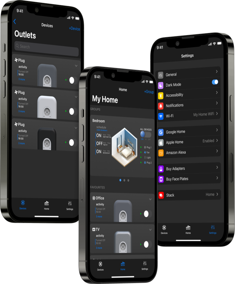
The VoltSafe Home App was designed to not only be visually appealing and engaging, but also highly usable and accessible. The UI style was inspired by the Jony Ive generation iOS 7 — we felt it suited the design of the physical product. The app combined some aspects of the clean minimal aesthetic while using realistic 3D renders to depict the corresponding real-life product.
The design system was built using the Atomic Design model for UI design by Brad Frost, ensuring consistency and scalability across all screens.
Onboarding
The VoltSafe Home app offers a seamless hardware onboarding process. Users can easily add one or multiple devices at once and provision them with their Wi-Fi credentials. To personalize the devices, users have the option to choose an aesthetic face plate that matches their real life device. Additionally, they can name the top and bottom receptacles of the added devices and add an icon for easy identification. The app also features a convenient “create group” feature, allowing users to group several devices together and perform group actions with ease.
Device Status & Monitoring
Users have the ability to control and view the status of each device. Each device card corresponds to a top or bottom receptacle. In the minimized view, the cards display necessary glanceable information, including a toggle switch to turn the device on and off. In the expanded view, users can view live power readings and the activity log. The realistic 3D graphics digitally mirror the live on/off and plugged status of each receptacle.
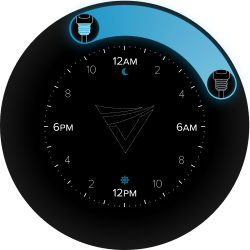
Scheduling & Circle Slider
With the ability to schedule devices, users can set multiple schedules for each receptacle individually or assign them as a group action. To facilitate this feature, the app incorporates the VoltSafe Circle Slider interface, which was previously used in the VoltSafe Winter product. This interface allows users to easily set on and off times for their devices, providing convenience and control over their electrical usage.
Customisability & Cross Compatibility
The VoltSafe Home Demo App also allows users to edit each device card at any time to update the name, icon, faceplate, control mode, and more. Furthermore, the app is designed to be cross-compatible with other VoltSafe prototypes showcased at CES 2023, such as the industrial unit MP-15 and the power distribution bar VoltSafe PDU. This compatibility enables users to seamlessly integrate and control multiple VoltSafe products within a single app interface.
Dark Mode
Of course, we can’t forget about our dark mode interface. Dark mode provides users with a sleek and modern interface that reduces eye strain and enhances readability. With improved battery efficiency on certain devices, dark mode offers a comfortable and customisable user experience in various lighting conditions. All three tabs are showcased in the dark mode UI theme.
Two CES Innovation Awards, NRC funding, and a partnership with La Grande
The VoltSafe Home app played a crucial role in testing and refining the VoltSafe Home technology. It effectively demonstrated the capabilities of the VoltSafe Home product, showcasing its safety, simplicity, and energy monitoring features in a clear and concise manner. As a result, VoltSafe Home was able to establish partnerships with homeowners and residential communities, and played a key role in securing funding from the National Research Council of Canada.
The VoltSafe Home was recognised as a CES 2023 Innovation Awards Honoree in the Smart Homes category for its innovation in home automation technology. This recognition significantly raised the profile of VoltSafe Home, attracting investors and generating further interest in the product.
This project taught me that the demo product is a design discipline of its own
The VoltSafe Home Demo App effectively showcases the innovative features of the VoltSafe plug design and has received positive feedback. By understanding the target audience’s requirements, the app effectively communicates the benefits and potential use cases of the VoltSafe Home product. The official release of the VoltSafe Home product is expected in Q3 of 2025, demonstrating VoltSafe’s commitment to delivering a cutting-edge solution for home automation and electrical safety.
Unifying and scaling Samsung Knox.
Design SystemsEnterprise UXFigma
At Samsung, I worked on internal operational tools within the Knox Enterprise Suite — a platform used by IT and security teams to manage and monitor large fleets of devices across organisations. My work spanned two parallel tracks: shipping a new operational dashboard and leading a significant unification effort across the Knox Design System.
Enterprise IT teams managing thousands of devices need to act fast — and the interface has to make that possible
The Knox platform serves operational teams making real-time decisions about device fleets — security alerts, system health, policy enforcement. When information is buried, ambiguous, or inconsistently presented across tools, teams slow down. The cost of that friction isn’t a usability score — it’s missed incidents and longer response times. My work on both the dashboard and the design system was oriented around the same goal: reduce the effort required to find, understand, and act on critical information.
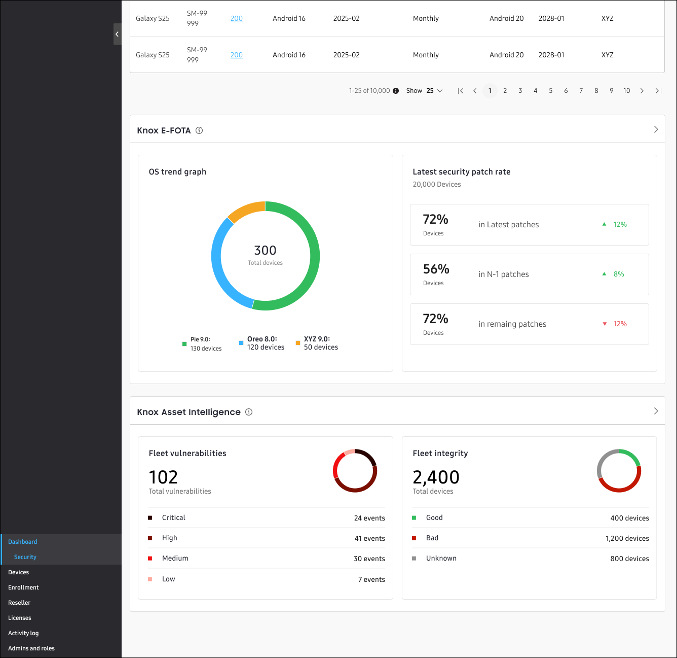
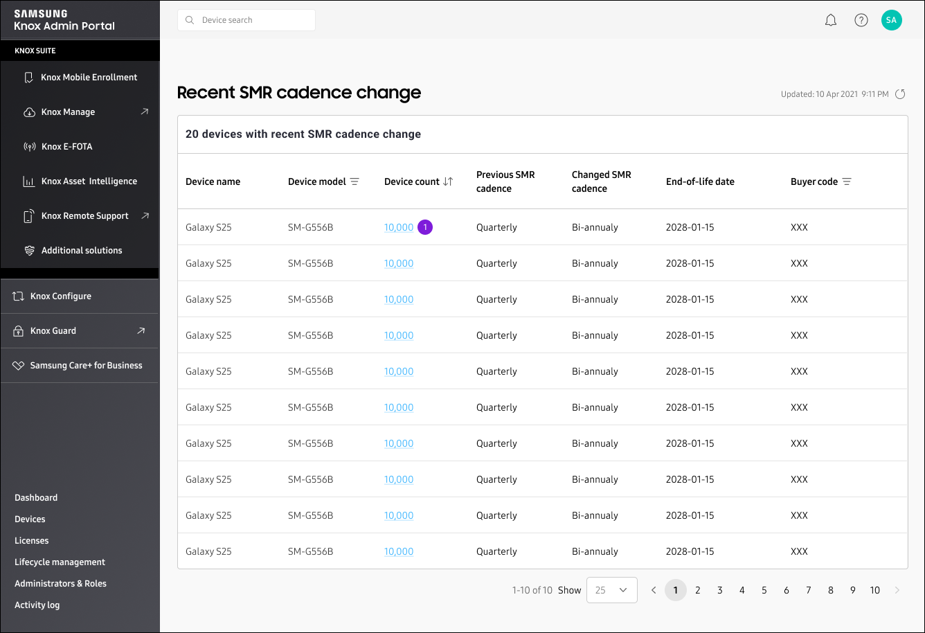
I designed shipped dashboard cards that surface system status and security signals at a glance
The operational dashboard needed to give teams an immediate read on fleet health without requiring them to dig into individual device records. I designed asset security dashboard cards, data visualisations, and information hierarchy that prioritised actionable signals over raw data density. The key design challenge was deciding what belongs at the glance level versus what lives one click deeper — every card had to earn its position by answering a question an operator would actually ask in the first 10 seconds.
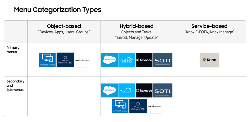
Operational platforms like Intune, Salesforce, and VMware informed how we structured navigation and data density
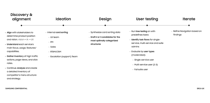
Before committing to a dashboard architecture, I defined a structured competitive research approach to evaluate how large-scale operational platforms handle data organisation, navigation, and complex system concepts. I reviewed seven platforms in depth: Microsoft Intune, VMware, Ivanti, Salesforce, MaaS360, Hexnode, and SOTI. The research helped clarify which structural models best support operational tasks at scale, reduce cognitive load, and allow teams to locate and act on critical information efficiently — without being distracted by data that doesn’t require immediate attention.
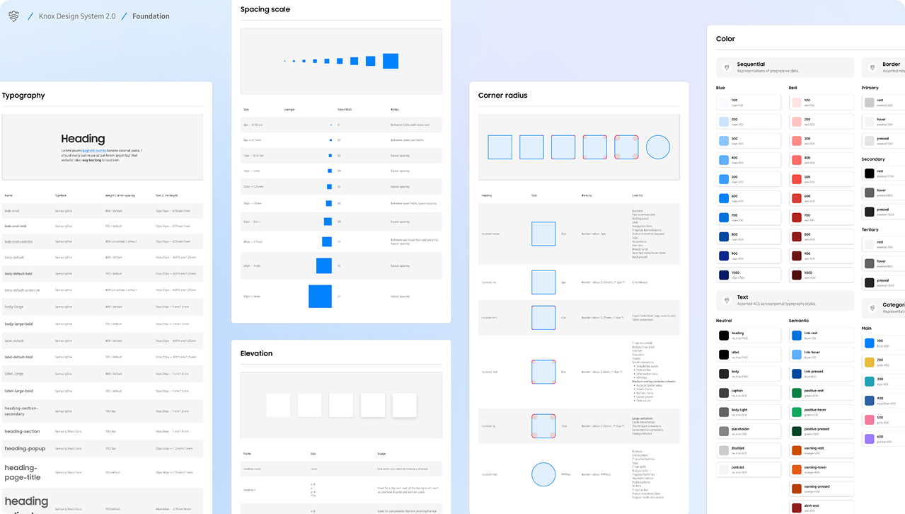
I audited and unified 65% of the Knox Design System — every component I touched cascaded into the ones below it
Design systems at enterprise scale accumulate technical debt quietly. Components diverge. Tokens drift. Documentation falls behind. When I joined, Knox was expanding across multiple teams and use cases, and inconsistency was beginning to create friction at the engineering handoff level. I audited the system and took ownership of 65% of the component library — not an arbitrary number, but the full set of components I touched, plus every trickle-down dependency they affected. The remaining 35% were newer, siloed components or already-completed work that had no shared sub-component dependencies with my scope.
For each component I touched, I aligned foundations — typography, colour, tokens, documentation — rebuilt them into flexible variant-based patterns, and updated best practices to ensure the changes propagated smoothly without disrupting work already in progress across teams.
The nested table pattern solved a problem no existing component could handle: representing hierarchy with dependencies
One of the new system solutions I introduced was a nested table pattern designed specifically for representing hierarchical data with dependency relationships. In Knox, this surfaces in privilege structures — an admin account with cascading permissions to sub-accounts, where deleting a parent node has defined consequences for the branches below it. No existing table component handled this cleanly. I designed the pattern from scratch to communicate hierarchy, show dependency relationships clearly, and behave predictably when nodes are modified or removed.
Design system work at this scale is change management as much as it is design
Rebuilding 65% of a live design system used by multiple teams is not a design exercise — it’s a coordination exercise. Every change had to be scoped, communicated, and landed without breaking what was already in production or in active design work. I updated documentation, version notes, and best practices in parallel with every component change, ensuring teams could adopt updates without guesswork. Reducing one-off designs and improving engineering handoff quality were the direct outputs of that discipline.
What I’d carry forward
The hardest part of design system work isn’t the components — it’s managing the blast radius of changes across teams who are building in parallel
Competitive research at the start of a dashboard project is high-leverage: the right structural model saves weeks of IA iteration later
The nested table pattern revealed a class of data relationship problems that flat table components can’t solve — hierarchical data with dependency logic needs its own pattern language
Variant-based components are only as useful as their documentation — rebuilding components without updating guidance just moves the inconsistency problem from Figma to handoff
Improving MSN’s reading experience without sacrificing advertiser value.
Ad ExperienceUX ResearchFigma
I worked directly on Edge, MSN, and Bing monetization surfaces, designing ad experiences embedded within content feeds and article pages used by millions of users. The challenge was to improve readability on MSN article pages by optimising banner ad placement — doing so while maintaining advertiser value without disrupting content consumption.
The tension
MSN article pages reach millions of readers daily. Banner ads fund the content they’re reading — but place them wrong and you erode the experience that makes the platform worth advertising on. The brief was to find where the line sits.
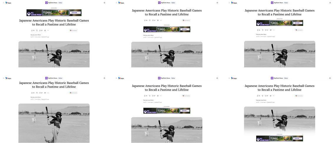
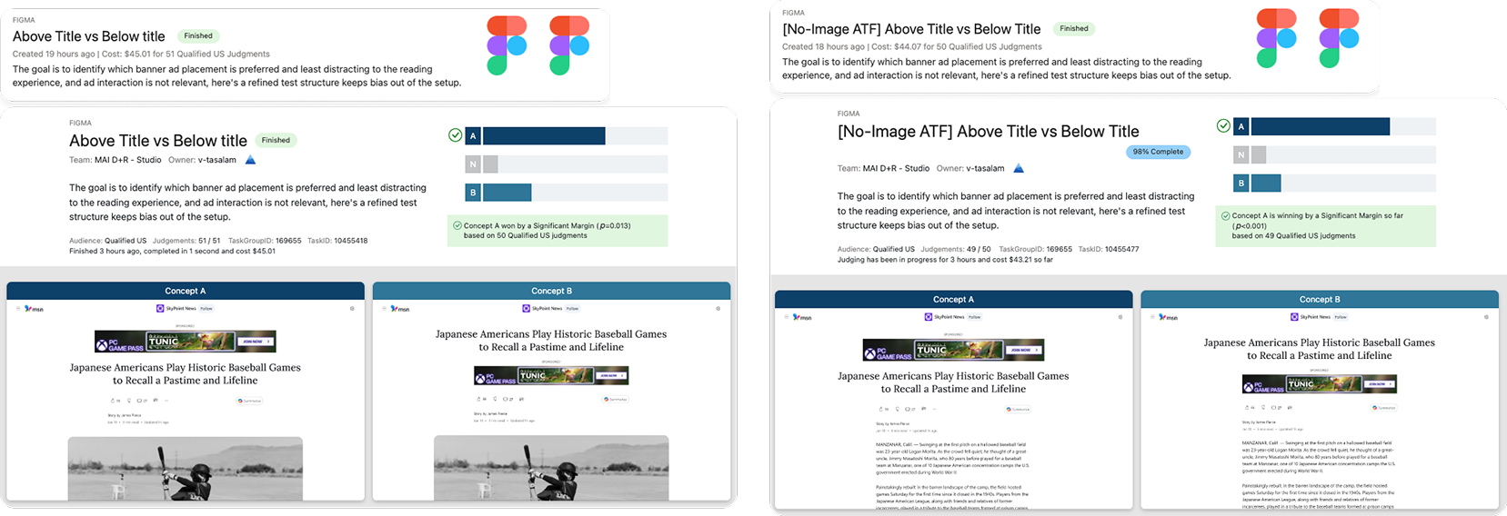
I evaluated 8 banner placement patterns and tested them against three user sentiment signals: readability, distraction, and perceived quality
MSN article pages serve millions of readers daily, and banner ad placement was creating friction between users and content. I mapped 8 viable placement patterns across the article layout, then designed a structured evaluation using UX Labs to measure how each one affected the reading experience. Users were surveyed on their ability to recall article content versus ad details, and directly questioned on which placements felt less disruptive.
Interactive prototypes simulated real reading flow — static mockups wouldn’t capture how banners actually behave during scrolling
I built mid-fidelity interactive prototypes that replicated the full article reading experience, including scroll behaviour and banner rendering timing. This was a deliberate choice — testing static screens would have masked the exact friction points we were trying to measure. Feedback from participants reflected real consumption patterns, not reactions to design presentations.
Above-the-title placement shipped: users noticed the ad, but it stayed out of their reading path — a tradeoff that satisfied both readers and advertisers
Of the 8 patterns tested, above-the-title banner placement emerged as the recommendation. Users were still aware of the ad — banner blindness was an acknowledged risk we tracked — but placing it before the content began meant readers could engage with the article without interruption. It also landed first on the page, making it commercially viable for advertisers. I synthesised findings into a clear recommendation aligned across design, product, and engineering, and the pattern moved forward to development.
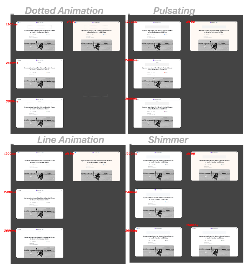
Page load and ad fetch almost never happen at the same time — a pulsing loading state was designed to brace users for the incoming banner
Because the page and the ad server operate on different timelines, a banner appearing mid-read without warning created a jarring layout shift. I designed a pulsating loading state to occupy the banner space during the fetch delay — signalling to users that something is coming, so when it arrives it feels like resolution rather than disruption. I evaluated multiple motion concepts across varying durations and bézier curves before landing on the pulsing approach as the least intrusive.
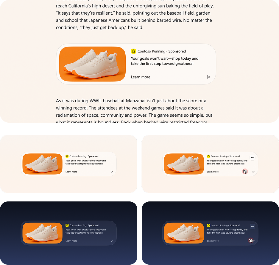
The same evaluation framework extended to intra-article native ads, where layout stability mid-read is even harder to get right
With the banner placement framework validated, I applied the same evaluation methodology to native ads embedded within article bodies. The constraints here were tighter — any layout instability mid-article directly breaks reading flow. The resulting design integrates within the content structure, preserves image hierarchy, and surfaces sponsorship labelling clearly, reducing disruption while maintaining the visibility and trust signals advertisers require.
Good ad design isn’t about making ads invisible — it’s about making them earn their place
This project sat at one of the hardest intersections in product design: user experience and advertiser value pulling in opposite directions. The answer wasn’t to hide the ad or minimise it into irrelevance — it was to find the placement where both sides of that equation could coexist. Above the title won because it respected the reading path while still delivering first-position visibility. The pulsing load state solved a technical seam that most users would never consciously notice — which was exactly the point. Working within Microsoft’s scale meant every decision had to be defensible across design, product, and engineering simultaneously. That constraint made the process more rigorous and the outcome more durable.
What I’d carry forward
Banner blindness is a long-term variable, not a solved problem — the above-the-title placement warrants ongoing measurement as user patterns shift
Testing with interactive prototypes versus static screens changed the quality of feedback significantly — the medium of the test matters as much as the questions asked
Motion design at this scale has to justify its existence functionally, not aesthetically — the pulsing state works because it solves a real timing problem, not because it looks good
The same evaluation framework transferred cleanly to a second ad format — building reusable methodology is as valuable as the individual finding
VoltSafe Marine — a complete IoT ecosystem for the marina industry, from dock to dashboard.
Marina operations in 2023 still ran on paper printouts and daily dock walks
Sterling, the Harbour Master at the Royal Vancouver Yacht Club — one of Canada’s most prestigious yacht clubs — started every day the same way: walking the marina with a printed sheet of paper, manually checking which slips were occupied, which pedestals had issues, and which boaters needed attention. It was the industry standard. It was also entirely avoidable. VoltSafe Marine was designed to change that, and my job was to design the digital ecosystem that would make it real.
I was the end-to-end designer across three interconnected platforms: the power pedestal hardware, the enterprise web app, and the boater mobile app
This wasn’t a single-surface project. The VoltSafe Marine ecosystem required a unified design language across physical hardware, a web dashboard for marina operators, and a mobile app for boat owners — all of which needed to communicate the same real-world device state in real time. I owned the design of all three, ensuring that what a marina attendant saw on the web matched what a boater saw on their phone, and what both saw matched what was physically happening on the dock.
Before any screens were designed, we physically printed and arranged the dashboard components on a table
The ideation process started away from screens entirely. I brought together the product team and engineers for two collaborative sessions where we printed individual dashboard card elements, laid them out physically on a table, and rearranged them by hand. This tactile approach let everyone — designers and engineers alike — contribute to the information architecture in a way that a Figma file never could. A second more technical session followed to pressure-test the card interactions and scope the build. The resulting layout was grounded in what the team understood was both useful and buildable.
Designing for marina staff and boat owners at the same time meant solving two completely different problems with one system
Marina operators need to manage hundreds of slips simultaneously — knowing which are occupied, which have power issues, which boaters are overdue on payment. Boat owners need exactly the opposite: a single focused view of their one slip, with clear status, control, and alerts. A modular design approach let me serve both without compromising either. Customisable dashboards and app settings adapted to each user’s role while maintaining a shared visual language across the ecosystem.
The real-world synchronisation problem
In an IoT product, the interface is only as trustworthy as its accuracy. When a pedestal changes state on the dock — a plug disconnects, a circuit trips, a boater connects — the app has to reflect that instantly. I designed buffer states to communicate data-gathering moments and built in visual indicators that only surfaced confirmed, verified information. A marina operator acting on stale data isn’t just inconvenient — it’s an operational and safety risk.
The enterprise dashboard gave marina staff a live visual map of every slip — replacing the daily dock walk entirely
The slip map was the centrepiece of the web app: a real-time colour-coded visual of the entire marina where each slip reflected its current occupancy, power state, and any active alerts. The spotlight card provided quick-access information and live status for selected slips, with a toggle to a detailed list view for operators who preferred tabular data. I also integrated a full CRM interface — customer records, invoices, payment tracking, and slip assignments — and designed a progressive disclosure check-in flow that auto-generated invoices as attendants stepped through the booking process.
The mobile app gave boat owners control, visibility, and peace of mind from anywhere
The boater-facing mobile app focused on a single slip — with power control, live energy monitoring, and safety alerts for critical conditions affecting their vessel. Dark mode was designed across all components from the start, not as an afterthought, improving usability in the low-light conditions that are standard in marina environments at night.
The IBEX Innovation Award from the National Marine Manufacturers Association validated the approach
VoltSafe Marine won the IBEX 2023 Innovation Award, presented by the National Marine Manufacturers Association — the body that sets standards for the recreational boating industry globally. The award recognised the system’s ingenuity and outstanding contribution to marine product development. The $180,000 BC Fast Pilot grant from Innovate BC followed, specifically enabling real-world pilot testing at scale — de-risking the technology for early adopter marinas through field installation and live operation.
Recognition & milestones
IBEX 2023 Innovation Award — National Marine Manufacturers Association
$180,000 BC Fast Pilot Grant — Innovate BC / NRC IRAP
Pilot installations at: Royal Vancouver Yacht Club (Wigwam Inn), Sun Harbor Marina at Port of San Diego, and Wigwam Marina
Active rollout continues across marinas in British Columbia and North America
“Sterling no longer walks the dock with a printout. That was the goal.”
Sterling no longer walks the dock with a printout. That was the goal.
The clearest measure of success on this project wasn’t an award or a grant — it was watching Sterling and his team at the Royal Vancouver Yacht Club switch from printed paper to a single screen. I was on site during the pilot install, onboarding his team directly and watching how they actually used the software in a live marina environment. That proximity shaped the product. Seeing the Harbour Master of one of Canada’s most recognised yacht clubs rely on something I designed, in real conditions, to manage real operations — that’s the validation that mattered most.
What I’d carry forward
Designing across hardware, web, and mobile simultaneously requires a shared source of truth for device state — the moment those surfaces diverge, user trust collapses
The physical card printout sessions produced better IA decisions faster than any digital workshop tool I’ve used — getting engineers in the room to co-own the layout changed what was scoped
An IoT product’s biggest UX risk is latency — buffer states and verified-data design patterns are not nice-to-haves, they’re the core of the trust model
Being on-site during pilot installation gave me design insight that no user interview could replicate — watching real operators use real software under real conditions is irreplaceable
The modular dashboard approach that served both marina staff and boat owners proved that a shared design system doesn’t mean a one-size-fits-all experience


.webp)


.webp)


.webp)